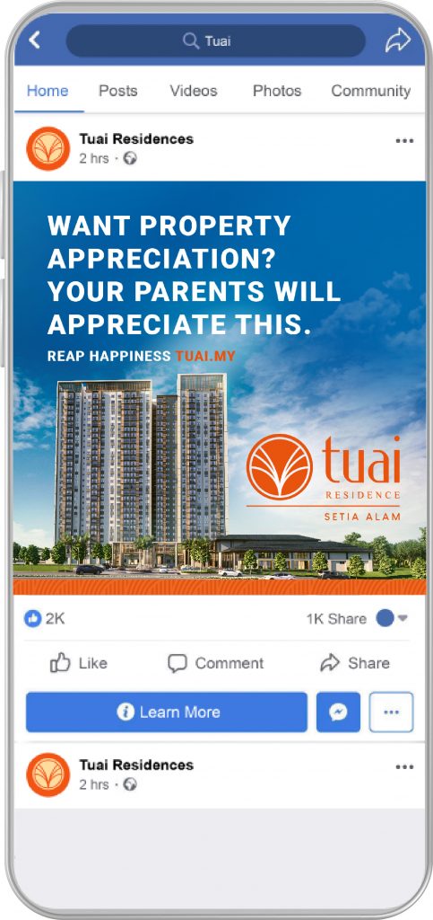
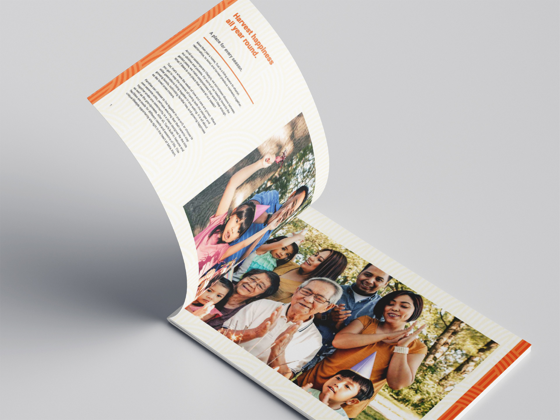
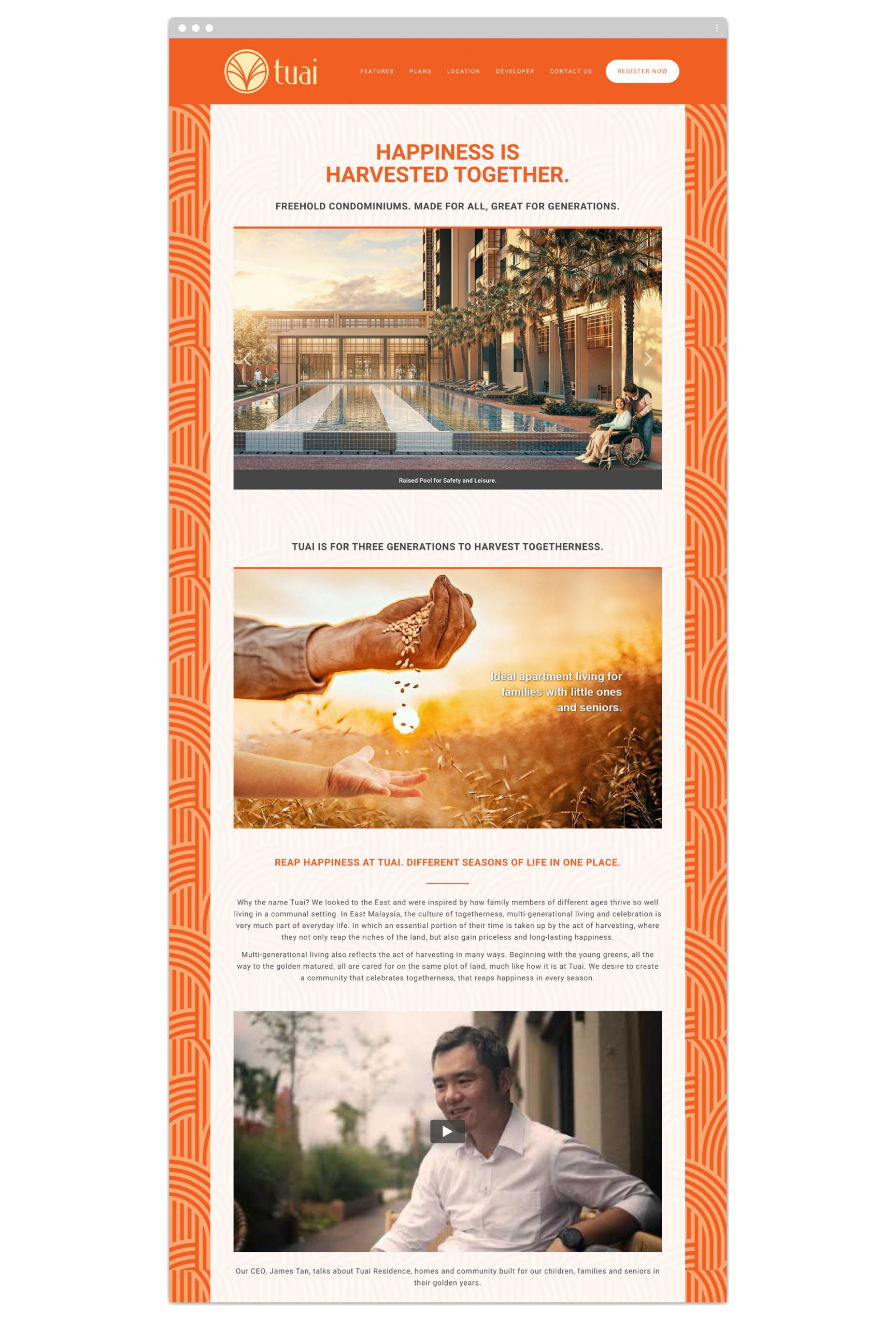
Families find a HARVEST OF GOLD.
We showed more heart than any developer
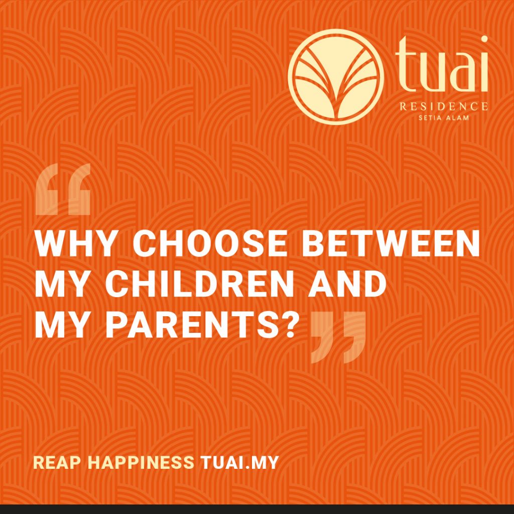
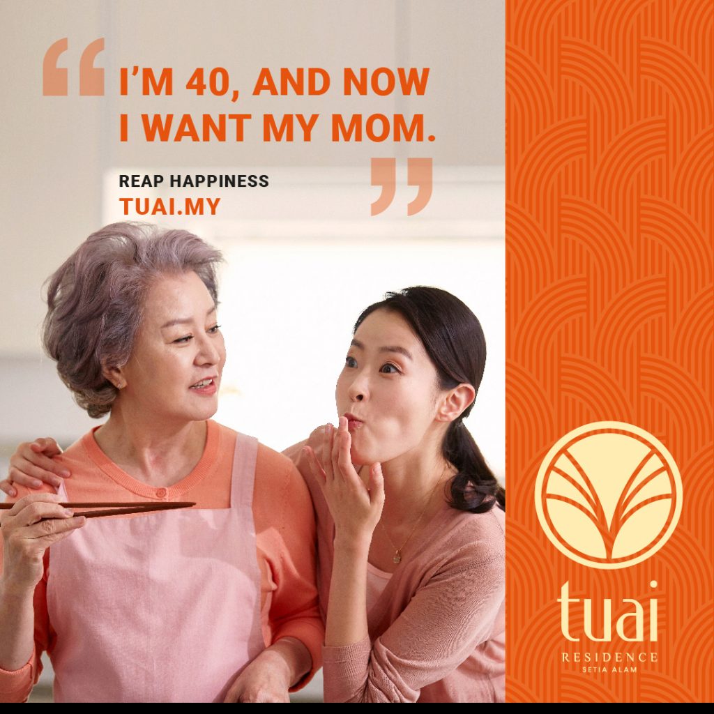
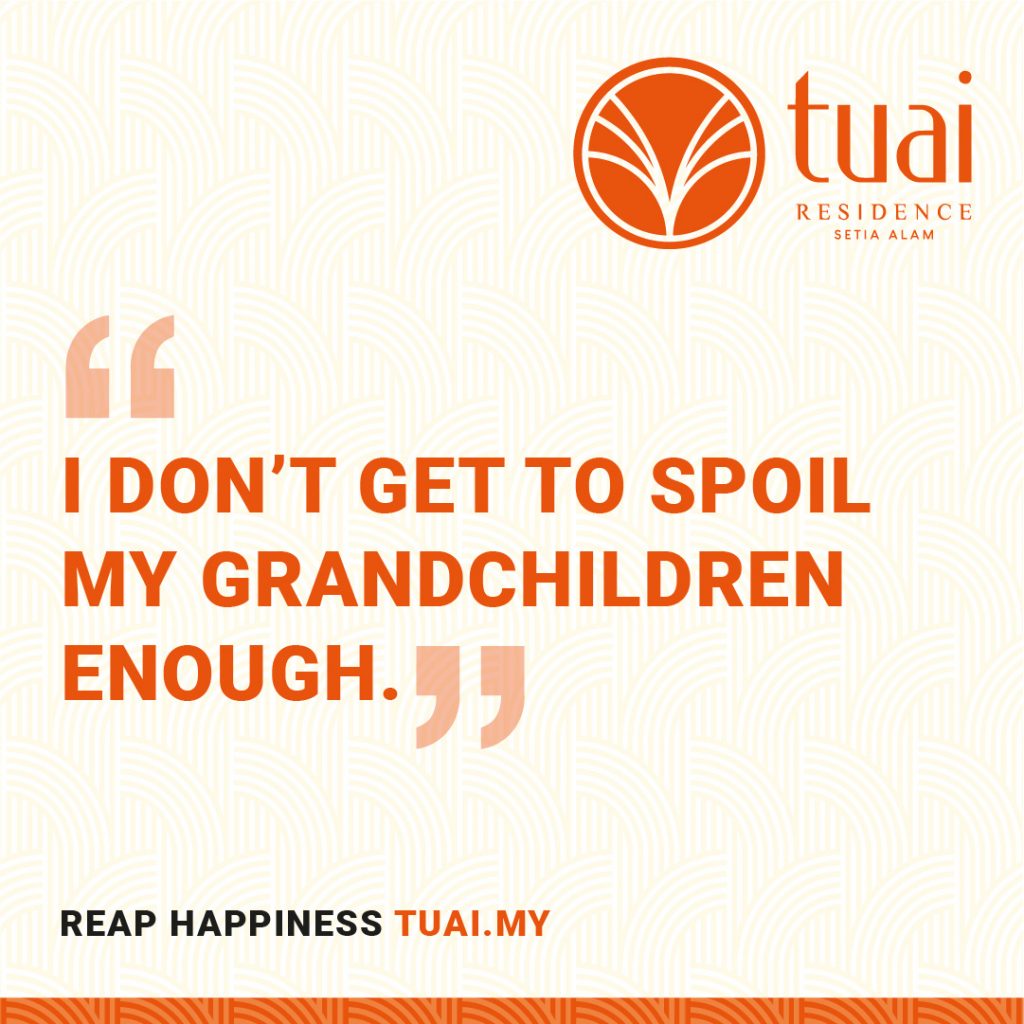
Retirees and the sandwich generation took notice, because we understood them.
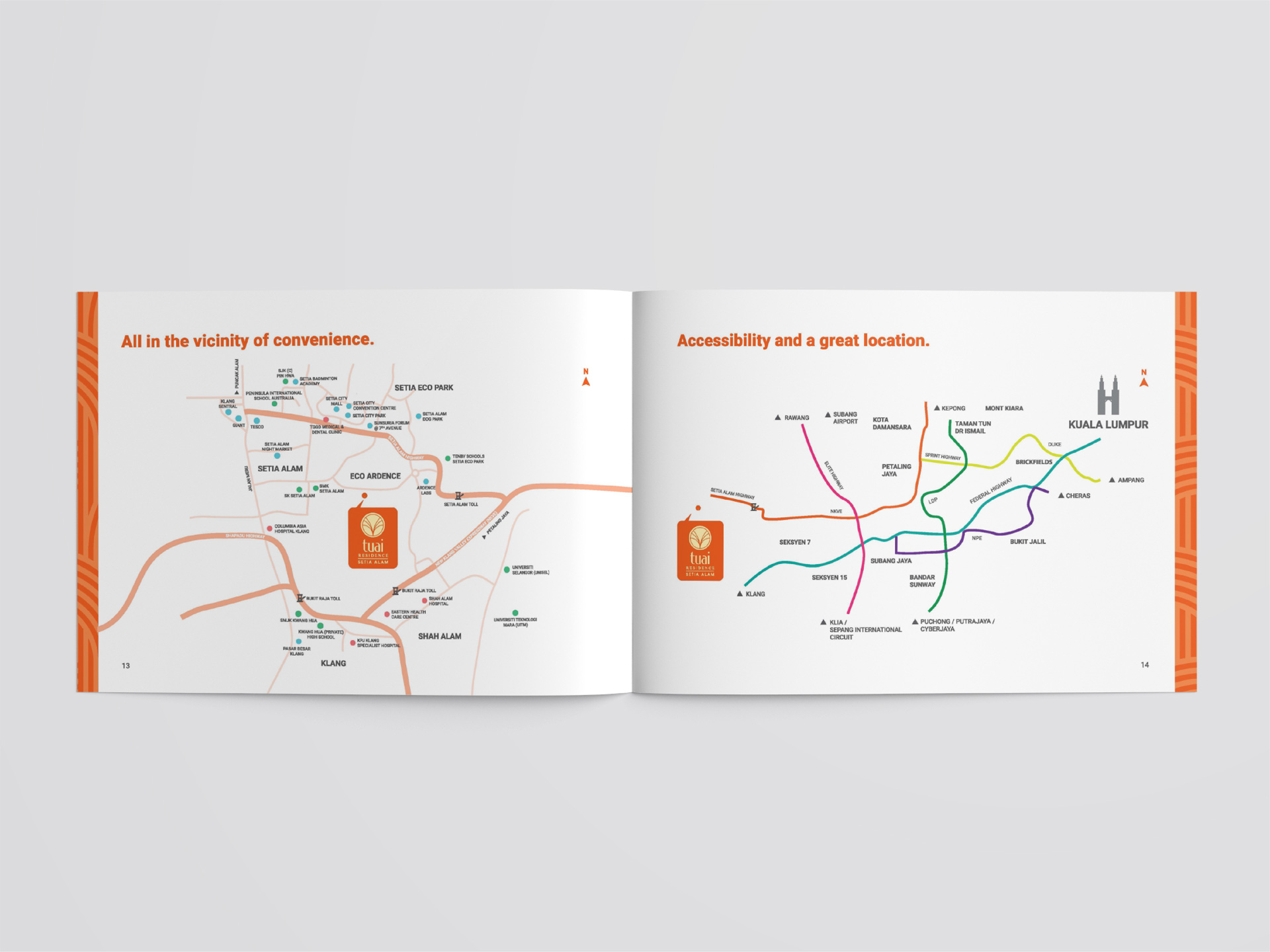
It’s happening right this moment in Setia Alam.
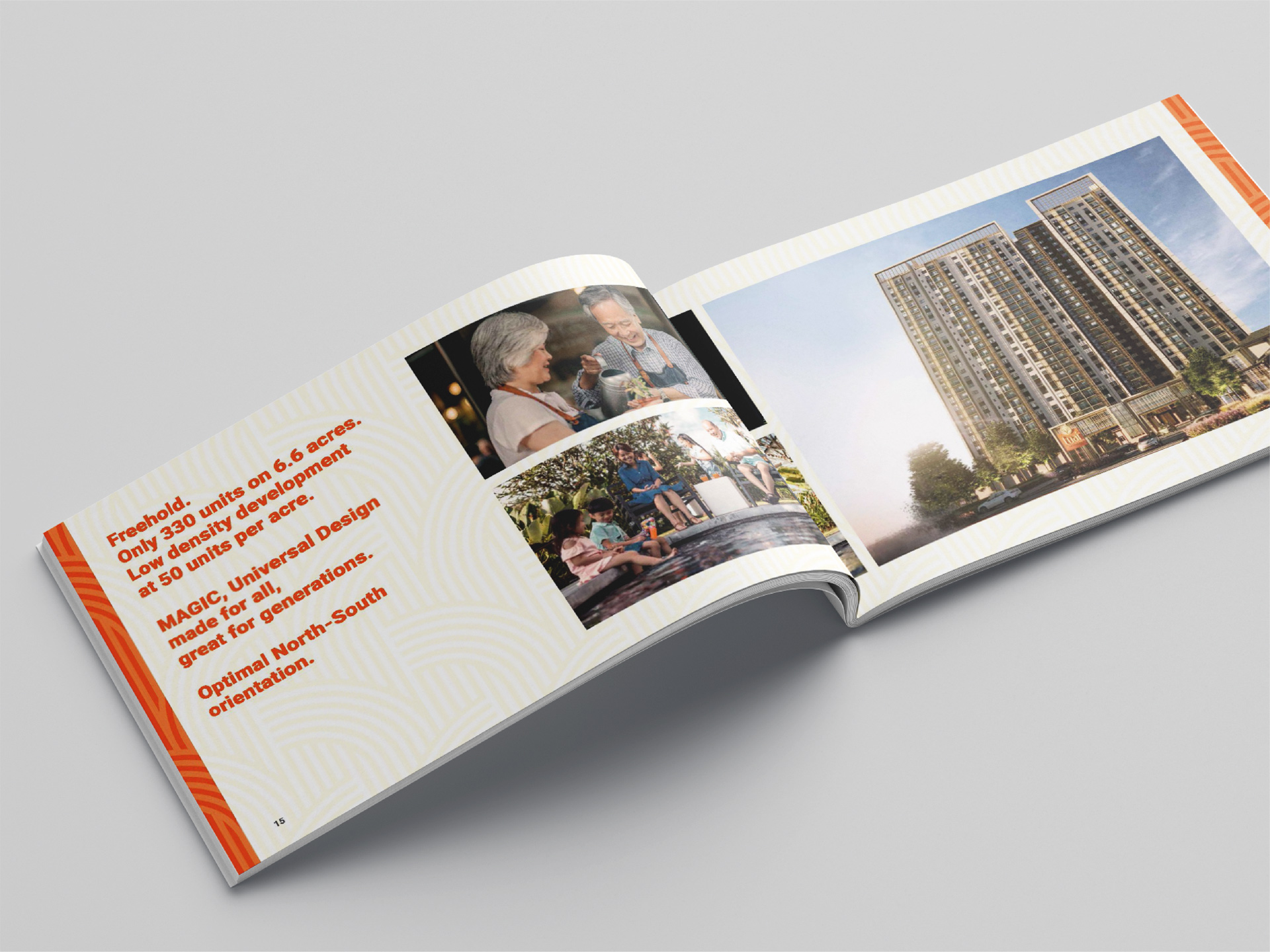
This unique project targetting retirees and the sandwich generation sought the help of an ad agency at the planning stage, so that the overall direction could be applied to the design and experience of the development.
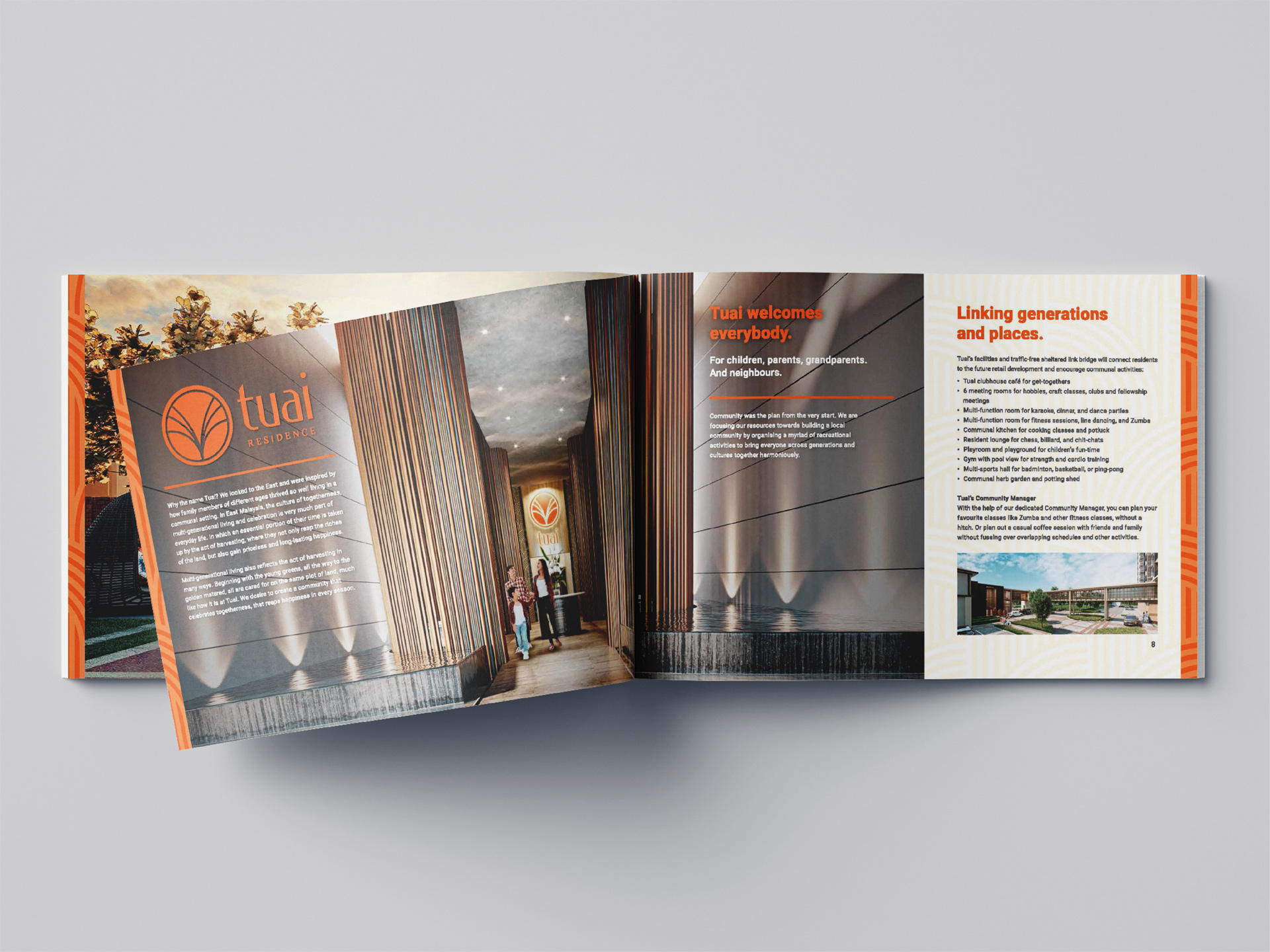
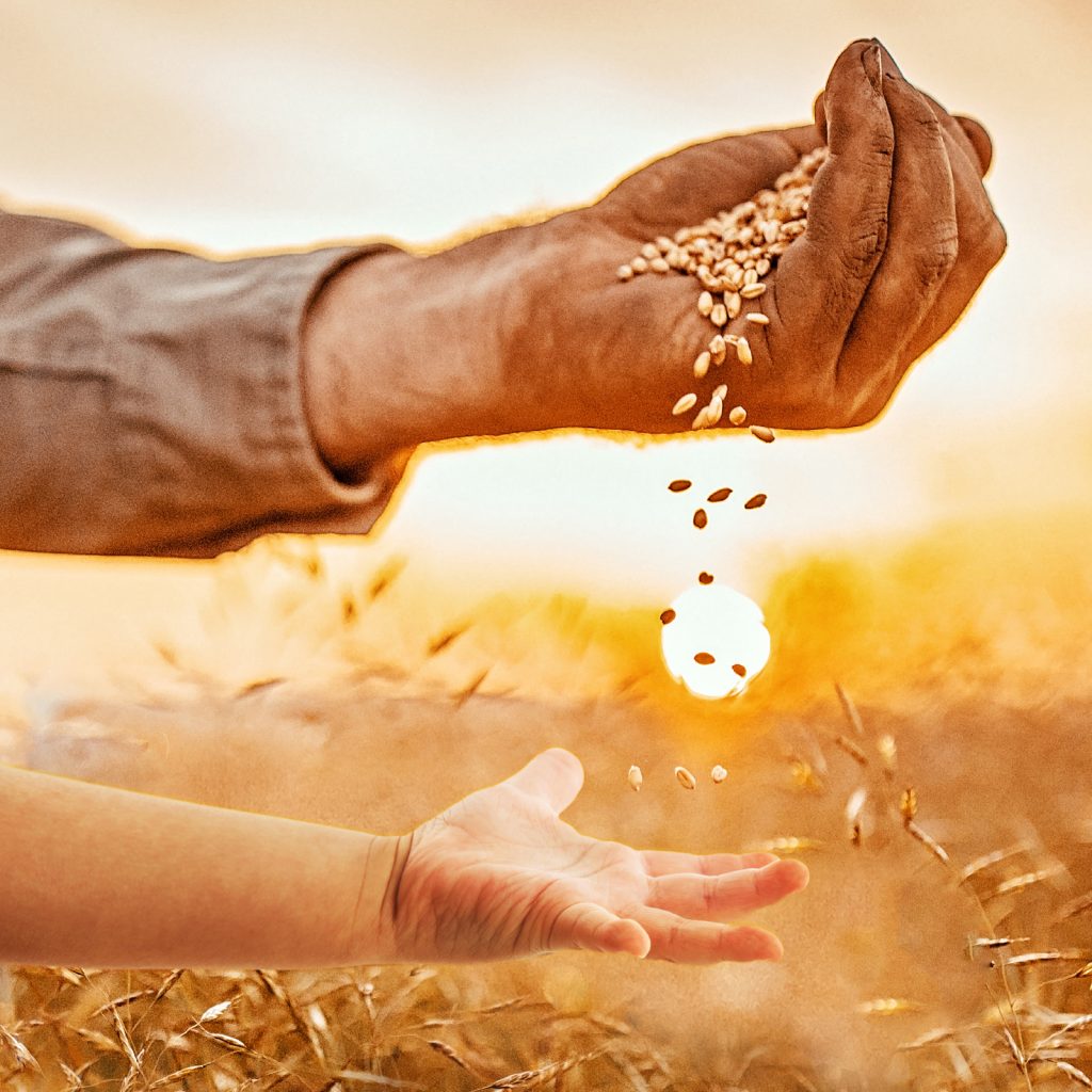
The name, branding and general concept was developed after a month of focus groups. While branding was inspired by the multigenerational living ways of East Malaysia – hence Tuai (the culture of harvesting and togetherness), the communication went along the route of closing the gap between the generations.
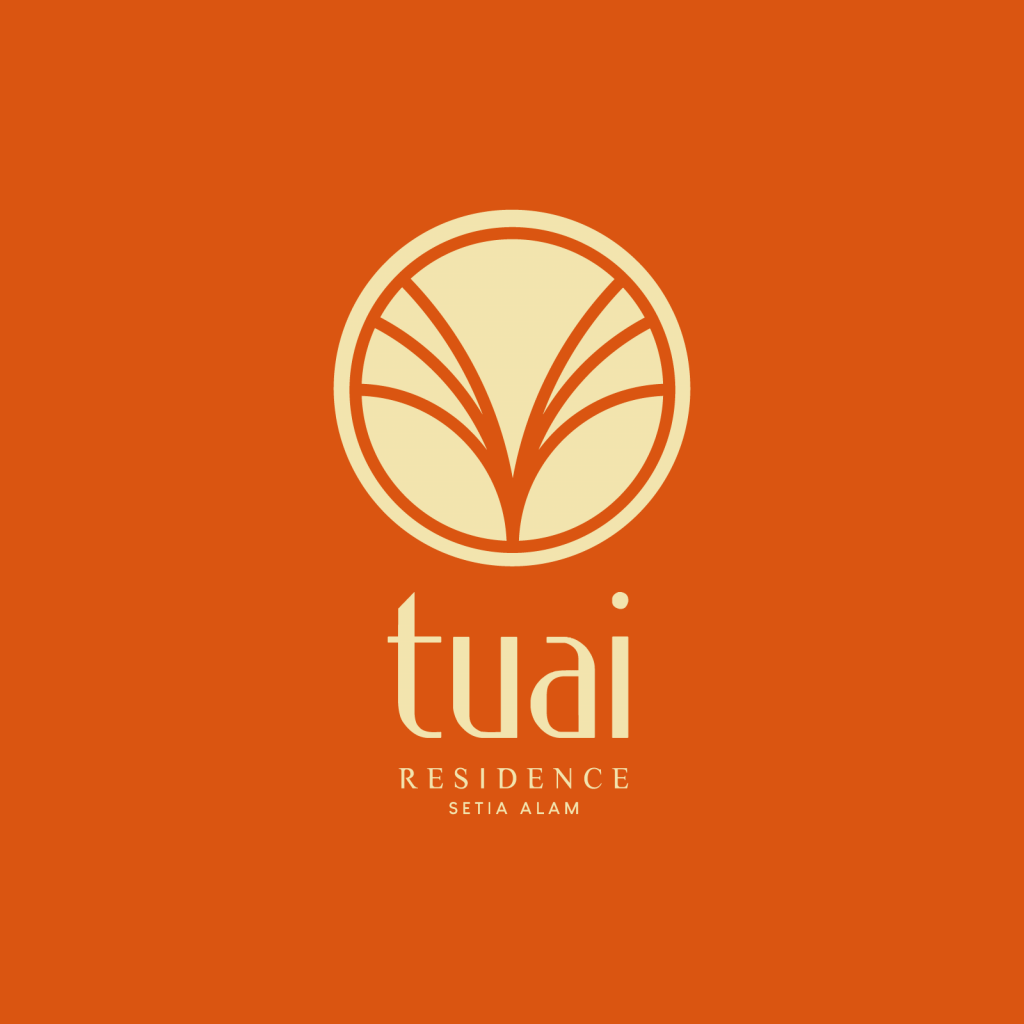

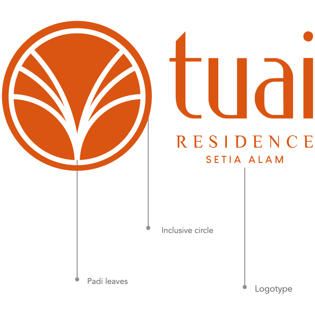
TUAI
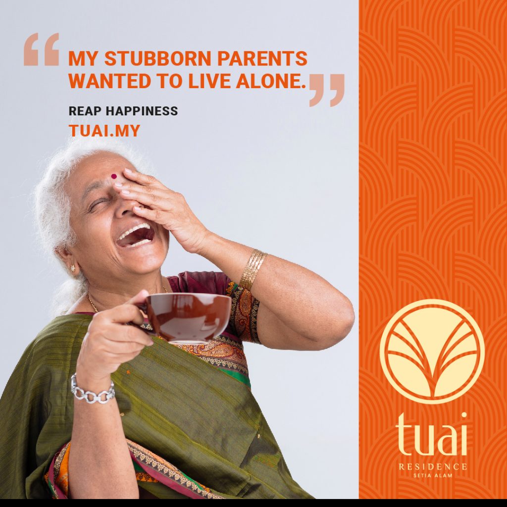
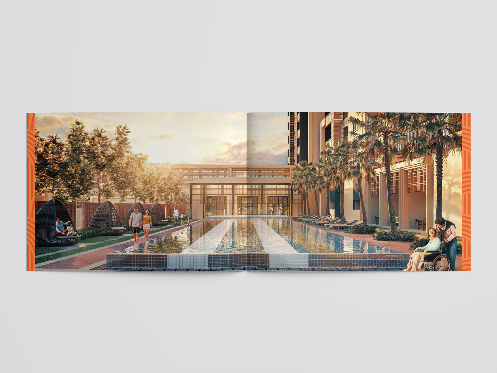
Tuai means to harvest. Since our development is all about multi-generational and communal living, Tuai reflects familial growth and a concept of cultivating close ties with one another despite the gap in ages. It is all about harvesting precious moments together, and creating bountiful memories all in one place. The tagline “reap happiness” projects this very thought.
FONT
Depicting sturdiness, yet friendliness, with the ‘t’ and ‘i’ holding the name together harmoniously, while looking like both arms in the air in celebration.
ELEMENT
The logomark is based on a rice paddy – the staple for Asians. It is also a symbol of wealth and humility among local communities. The stems are growing away from each other to demonstrate the facilities and amenities available for people with different needs. The padi leaves are open in a welcoming gesture. The circle around the padi leaves symbol shows inclusivity.
COLOUR
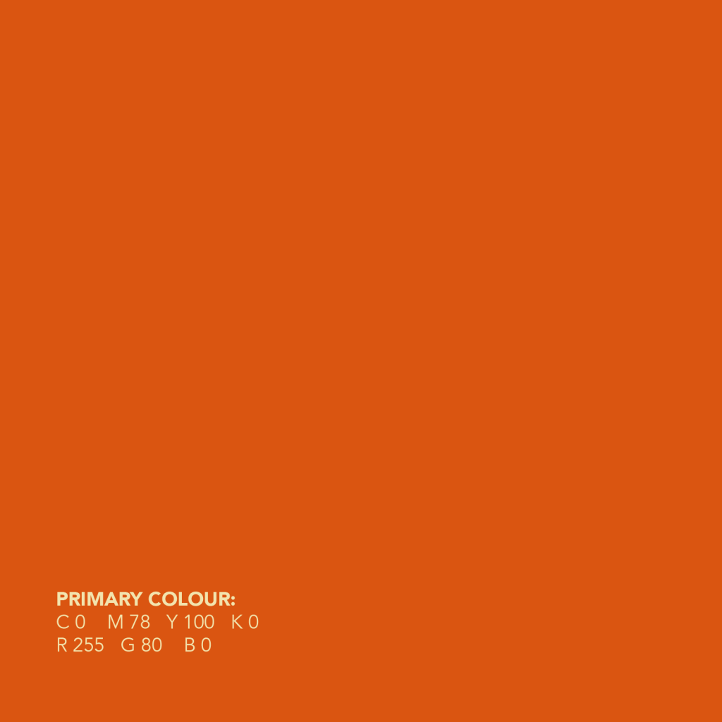
Orange is the combination of energy (red) and happiness (yellow). Usually associated with sunshine, warmth and joy. The colour increases the oxygen to the brain, stimulating mental activities making it a highly acceptable tone for young and old people alike.